View live site

Project Title

MyLife College

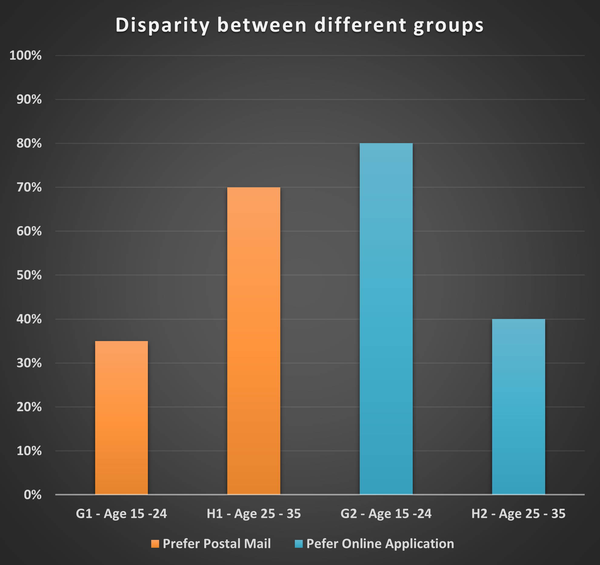
The website is that of a College where users can send their college applications online and get feedback.

Project Duration

October - December 2023

Project Overview

This is a project that is ideally based in a third world Country setting. It is an educational institution of higher learning for people who have just finished High School or secondary school. This was inspired by my own experiences after I finished high school. Hypothetically, MyLife College is aiming to be a top-tier educational institution in providing the best user experience for students. Mainly, information sharing and ease of access to new updates in regards to applications and other necessary information. The most important aspect is helping new or prospective students navigate how to apply and enroll for college.

Tools Used

Figma
Photoshop

My Role

UI Designer,
UX researcher

The Problem

This project was inspired by the problem I and many others observed in Malawi. The lack of proper school websites that provide users with a good experience that fulfills their needs.

  • The main problem is the challenge of using mail postal service to apply to most schools.
  • The traditional method of posting mail is costly and time consuming for both the applicant and school.


One of the reasons why online application systems are not common is lack of resources. internet accessibility is not very widespread which is self-explanatory as to why few would even need an online application. Regardless, there is a surge in smartphone usage and internet cafes. People who have the means to go to the post office have means to access an internet café and apply online while saving some money to themselves. Second reason is that I believe there is a need for the society to keep the mail postal industry running.

The Solution

The goal was to create an opportunity for those with means of internet accessibility. With a very small step like promoting online applications, this would save the applicants money and greatly reduce the workload of the school admissions department. It’s easier to skim through a directory of names on the screen than open hundreds or thousands of envelopes.

The solution was to design (and develop) a responsive website where users will have access to all they need to know about the school. An additional feature would be for users to pay their application fees through Airtel Money or TNM Mpamba. Airtel and TNM are the main Telecommunication networks in Malawi. Virtually every Malawian uses one or both of these Telecommunication networks. This is also a convenient option and time saver.

Design Process

1

Research

Research was the first step in the Design process. This was important to ensure that nothing is based on assumptions.

2

Define

Defining came second even though before the research, I had a faint reason as to why the project had to be created. The research facilitated a proper ground to define the design.

3

Design

This is where the layout of the ideas took place. Everything from wireframing to actual UI design using Figma

4

Prototype

This is where I turned the UI design into a draft version of what the interaction would feel and look like.

5

Evaluation

As the last design process, I always try to evaluate the design to see if there are any faults

Design Timeline

Design Target

The target demographic for this design are young adults who either just finished high school or anyone who wants to earn a bachelor's degree.

User Research

In my research I used both Qualitative and Quantitative research to collect data. For the qualitative research, I asked 5 people about their thoughts, experiences and the difficulties they face with school applications.

1. Interviewing focus groups

The focus group was interviewed by asking a couple of questions. The goal was to have their perception. The visual representations depict the data that was collected.

Simply put, the younger people always showed more enthusiasm for online applications than their counterparts.

Pain Points

1

Support

  • Lack of live support
  • Wait time for response from support

2

Application Process

  • Long application form
  • A lack of progress indicators or confirmation messages

3

Financial Pain Points

  • Only two options for payment
  • Applications require money to be processed

Hi-fi Wireframes

wireframes

Home-Page

wireframes

Home-Page

wireframes

Apply-Page

wireframes

Apply-Page

wireframes

Post-Page

wireframes

Post-Page

wireframes

Blog-Page

wireframes

Blog-Page

wireframes

About-Page

wireframes

Footer

Prototypes

Prototypes can only be viewed on a wide desktop screen. However, you can view the live site here

Style Guide

Color Pallete

Typography

Buttons

Lessons & Next Steps

Lessons Learned

This was an exciting project that challenged me and gave me a lot of lessons. Initially, I was overwhelmed and stuck but it all worked out in the end. There are a few things that I have learned from this project:

  • The need for a team is critical and necessary. I embarked on this project alone and there are obviously conscious and unconscious biases. Having multiple people can drastically help the design process and alleviate alot of biased thinking.
  • The importance of a user is another thing I learned. A user is the focal point of any design and has to be treated as such. Often times, I'd relapse and think of the design like my own art. This is something I have to work on moving forward to avoid misunderstanding users.

Next Steps

Moving forward, I will always appreciate a team of other designers and researchers. It's true that there can never be a perfect design. However, when there are enough people to help with designing, it's easier to produce something that really understand the user and solves problems.

The End